Which area in the US has the most temperate days?
Created by
Eric J.S.
Posted
September 2, 2021
Last updated
May 24, 2022
Category
Analysis
Tools Used
QGIS
Summary
I’ve found that I’m most comfortable outdoors when the temperature is between 60 and 80 degrees fahrenheit. Usually, that means I’m only comfortable in the Spring and Fall seasons in Delaware. Many people circumvent their temperature discomfort with a second home, but that isn’t an option for me. Since I’m planning on moving soon, which areas of the United States offer the most days of the year with mild daytime temperatures?
Data Acquisition and Processing
The National Centers for Environmental Information calculates climate normals every 10 years based on historical weather observations dating back to the 1950s.
Normals act both as a ruler to compare today’s weather and tomorrow’s forecast, and as a predictor of conditions in the near future. The official normals are calculated for a uniform 30 year period, and consist of annual/seasonal, monthly, daily, and hourly averages and statistics of temperature, precipitation, and other climatological variables from almost 15,000 U.S. weather stations.
National Centers for Environmental Information
The weather stations are fairly evenly spread, and should allow for good interpolation.
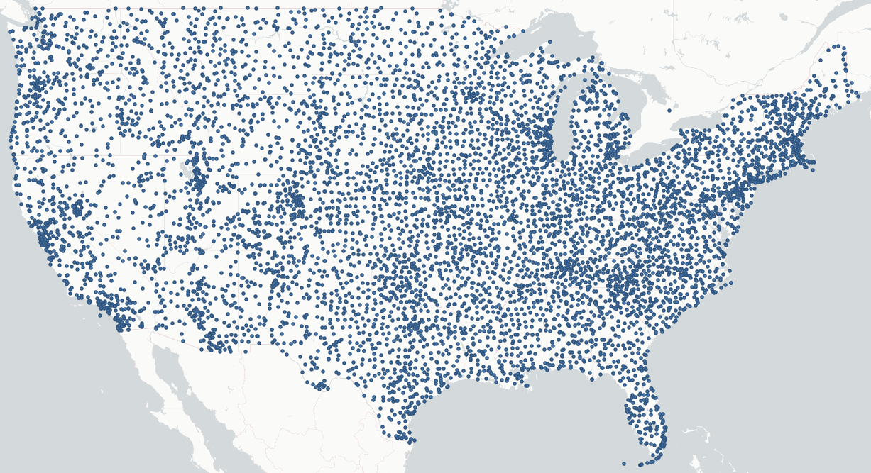 Distribution of contiguous US weather stations used in this analysis.
This data came in multiple CSV files, the useful ones being the daily temperature averages and the listed weather stations. The weather stations had about 7,000 rows while the daily temperature averages contained about 2.6 million rows, which did become a problem. Every time I wanted to view the table, I had to wait minutes for it to load.
The first step was to mark days that had a maximum temperature between 60 and 80 degrees fahrenheit. I added a column to the temperature data and marked a 1 for true and 0 for false. I avoided a boolean value so I could count the days easily for each weather station simply by summing the value of that column.
Second, I used the Statistics by Category tool to generate a new table with summary statistics of the new column I created. The output included the sum and mean of the new column which I joined with the weather stations table.
The final processing step was to generate interpolation rasters. QGIS offers two choices: Triangulated Irregular Network (TIN) interpolation and Inverse Distance Weighted (IDW) interpolation. IDW interpolation makes more sense for this analysis, I won’t get into why, but you can read a good explanation here.
Analysis
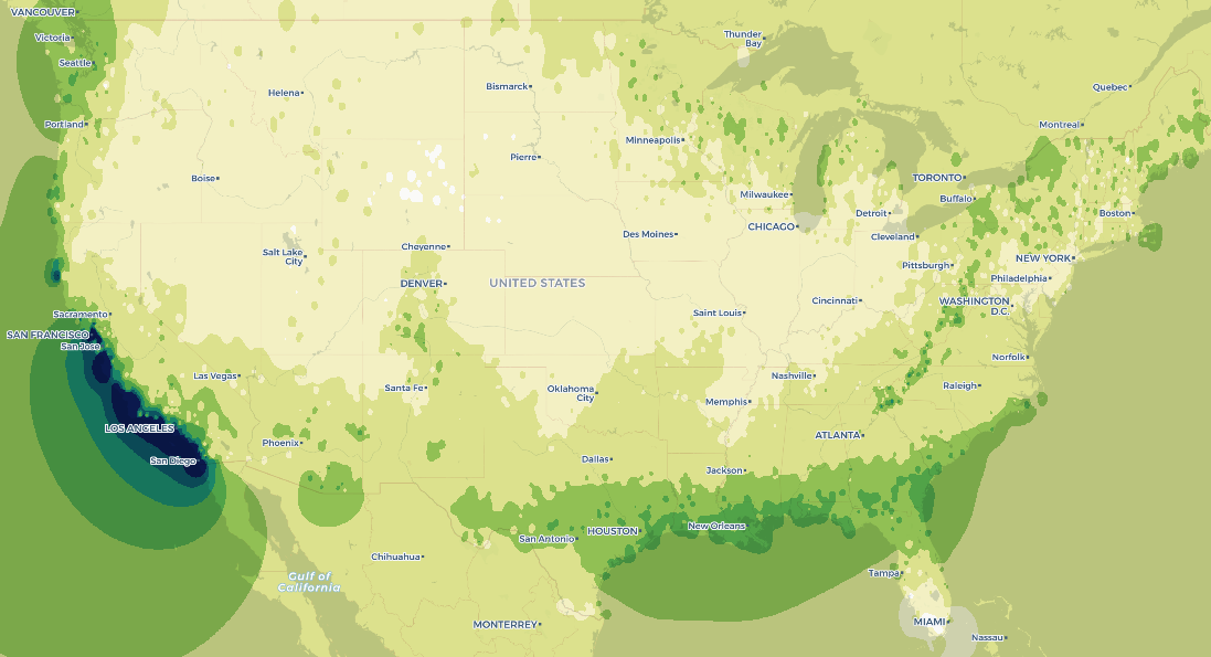
It turns out most of the contiguous US has a similar number of temperate days per year. The map does not display when those days occur, but it should be obvious that the southern states get temperate weather in the winter and the northern states get temperate weather in the summer. Let’s take a look at some notable areas.
Southern California
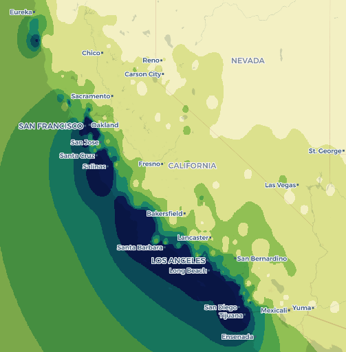 Southern California is one of the rare places that has temperate weather year round.
Pacific Northwest
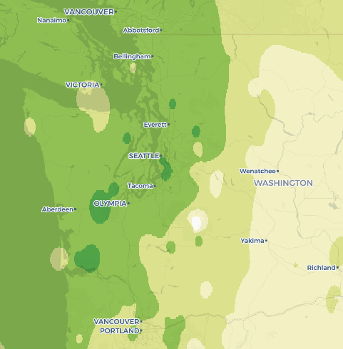 Most of the Pacific coast gets a fair number of temperate days, probably due to the Pacific Ocean keeping temperatures from getting too low in the winter.
The South
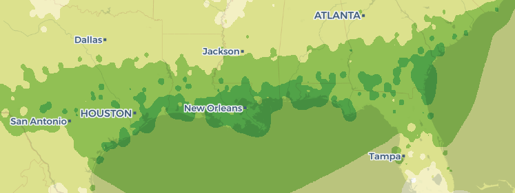 The sun belt is very prevalent on this map.
The Appalachian Mountains
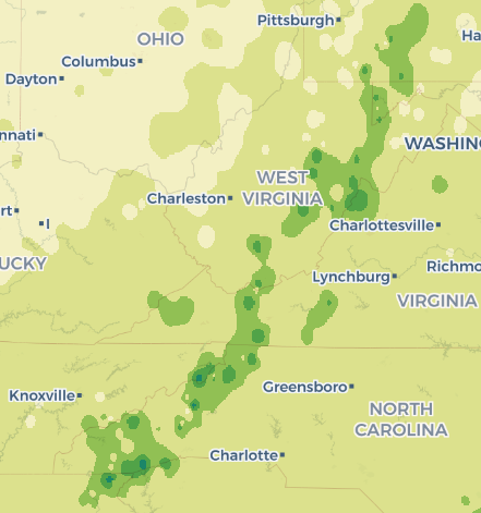 Green spots correlate to mountain peaks.
Conclusion
While there are many factors that make up “nice” weather, this map provides some insight to the areas which have a higher chance of providing such weather. Although it was already well known, my analysis really highlighted the temperate consistency of Southern California.
Data Sources
This map was based on 30-year climate normals from 1991 to 2020 found here:
https://www.ncei.noaa.gov/products/us-climate-normals
Notes About QGIS
I chose to use QGIS for this project to better understand its practicality. ArcGIS Pro is the industry standard (and for good reason), but I wanted to compare it with its open source alternative to form my own opinions.
QGIS does everything it needs to do. It’s certainly better than ArcMap, QGIS never crashed or threw unknown errors at me. But, it is certainly more cumbersome than ArcGIS Pro. The UI is old-school, with most of the options and tools hidden behind endless dropdown menus. All of my layers had to be saved individually, and my temporary layers were not automatically kept in a default database. It struggled with large data tables (2.6 million rows), insisting on loading all of the rows at once rather than loading as I scrolled.
Overall, it’s a viable alternative. Everything seems more explicit and straightforward. Will it ever be my first choice for geoprocessing? Probably not, but having some experience with it in my back pocket is definitely a good thing.